New At Society6 – On Sale Now


I like this as a wall hanging, but I don’t think it works as a tea towel. Weird I know. I think for the tea towel, maybe it should be crowded with fish, more and placed closer together.


My first idea was to make it look like a block print. I could see it in my head. But I just could not get it to work digitally. Maybe if I had used thicker lines, and marks on the fish. And made them look less perfect. I tried a technique to make them look as if some of the ink did not transfer, but it just didn’t work. I also felt the white was just too plain. Below are two samples.


Here is a close up of the detail in the final piece. Voting is now open. Fingers crossed.
Thanks so much for taking the time. 😊


Unexpected placed at 238 out of 486 entries with 44 votes. That is 48.9 %. The top design had 230 votes. The #63 design had 106 votes. The site displays the top 63 designs, the rest are listed below on the page.
Thanks so much for taking the time to vote. I really do appreciate it. 😊 You can see the top designs here. Scroll down a bit.
Have a super day! 😊


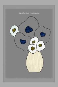
I started with the original painting as inspiration. Problems with Photoshop used up several days of my design time. A revamp was quicker than creating from scratch. What you see here, is all that is left from the original. I noticed several mistakes in the yellow blooms, so I eliminated them. I added digital outlines using the pen tool, for nice crisp edges.
I cleaned up the white blooms. The blue background was visible and made them look a bit dirty. The grey is the template that Spoonflower provides. The darkest, inner rectangle is all that will be visible when the design is printed.

I added color blocks and considered using them for the final piece. But they were too flat, and I thought a pattern in the background would be too much. I placed the plaid to find the right scale.


I decided to paint paper with three colors. Yellow, blue, and green. I scanned them in to get the texture and uneven color tones. The variations are less obvious, than in the original painting. But I think it “warms” the design, by having a hand made, imperfect quality.
The design brief really called for wacky, or strange. They showed a tennis ball cut in half to reveal a lemon interior. This may not be wacky, but it will be unexpected to some.
I am really starting to feel comfortable using the pen tool in Photoshop. I never thought I would say that. There were only three connections I had to smooth out. Just slightly. I am so stoked about that. And so grateful. Whew! 🤓
Voting is now open, until October 18th. Voting is easier on a computer or larger screen like a tablet. If you are using your phone, you need to scroll slowly, it can only load so many images at a time and you may miss seeing images without knowing it. There are only 484 entries, roughly a third of the usual.
Your votes help give me the chance to win cash prizes. Money I can use towards printing samples of my designs, which is a requirement to making them available for sale in my shop.

Tiger bark placed At 222 of 424 entries with 54 votes! Just shy of the top 50%. Woo Whoo! Thank you, thank you!😀