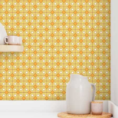
This pattern came by way of a long and winding path. Do you remember the Family Circus comic strips showing how young Billy spent his day? Yup, it was like that. The assignment was a non-directional wallpaper. One that might even work on ceilings.
I started with the idea of bamboo sprigs. Researched designs and colors for my mood board. Came back a day later and was thinking desert, prickly pear. Hmm.
I have this idea, to revisit some of my early design themes. Patterns that are one-offs. Then I can create a collection of similar themed prints. I started on a prickly pear. And changed my direction again.


Click on image to see full size.
My copy of The Grammar of Ornament caught my eye, and saved me from my indecision. I landed on the mediaeval chapter. The geometric patterns created by William Butterfield were appealing. He used them to decorate his brick buildings. Polychrome brickwork is a style of architectural brickwork where bricks of different colors are used to create decorative patterns or to highlight architectural features.
Butterfield’s designs were called diapers. From the Oxford Dictionary of Architecture:
diaper
Decorative pattern on a plain, flat, unbroken surface consisting of the constant repetition of simple figures (such as squares, lozenges, or polygons) closely connected with each other.

You are absolutely right. There is nothing “sage” about this. The title came to me as I was working, and it stuck. Definitely more of an avocado. Or Palo Verde green. (Arizona’s state tree.)
Voting is now open, until the 4th of July. Thanks so much for your interest and support!


Hey, Sheila. I went through all 18 pages of entries, but never saw yours or I would have voted for it. What page was it on?
Well, that is not good. Maybe the pages are jut taking a long time to load. I am going to vote now, I’ll let you know if I see it.
The pages load randomly for everyone. To be fair. Thanks for taking the time Teresa, so it was wasted. :O(
I found it Teresa, Whew! it was on page 12 for me. Thanks again for trying
Definitely not a favourite of mine – the colours just don’t do it for me (surprise, surprise), I also can’t see where you come up with it being a shade of green – maybe it looks different in person. Anyway, good luck with the voting.
It is a shade of yellow green. And you are right, it looks more yellow than anything. It looks different on the Spoonflower site, than it does on the phone. I have done another set in red, white and blue.
I knew you wouldn’t like it, Val.
Happy creating, Val!
Sheila, you’re back with a Spoonflower contestant! Off I go to vote! Love the story of your ramblings to get to Sunny Sage & Spice in the end, and thank you for a new definition of diaper : )
Haha. It was new for me too, Dotty. I know the English call them nappy’s. But I still don’t get the connection, LOL.
That was my new word for the day, or new definition. ;o)