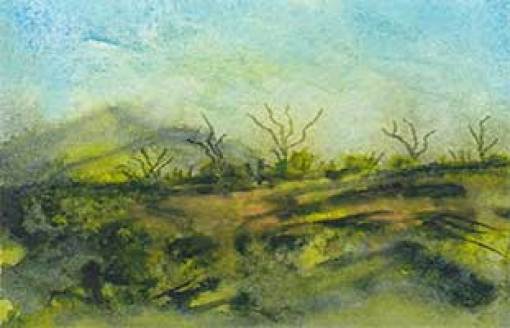
Three fun, but failed landscapes. I used one of the mini Legion pads, Stonehenge Aqua Coldpress Heavy. The other minis have 10 or 15 sheets, this one only has five. The paper is so thick, it is more like an artboard. I like that it can handle lots of water.
This is my last try. I like it, in spite of it not working as I planned. I thought about showing it vertically. But I decided I liked this view better, as painted. I think it could use more light areas.
I used Yellow Ochre, Indigo, and Green Gold. And the Indigo was the smallest proportion in each painting. They still went much darker than I wanted. I used a credit card to apply the paint and then sprayed water to get the paint flowing. Very little control using this method. It is better suited to larger pieces of paper. Still, I had fun experimenting!
Thought of naming this one, “Ocotillo before the bloom.”

Second try is too heavy handed. Too much pigment, not enough water.

So what do you think? Did I make improvements in the end?
Did my roundabout path to looseness pay off?

I really like the first one Sheila – It would make a great fabric. I like the second one too but the 3rd could use some lifting or scraping and maybe turn the dark blotches into rocks. A fun way to paint!
WOW! And I thought I really botched that one. All of them. I agree with #3.
Thanks, Val for your input! Have fun today 🙂
Always contrary, I like the first one best. It reminds me of an aerial view of English countryside. It just needs some of those dark areas converting to a rambling stream withwhite and pale blue or silver leaf. It has a really 3D look.
Wow, really? Thanks, Sea. 🙂 Hmm… maybe I can pull that off in Photoshop… or with gouache.
roundabout path to looseness =
straightforward path to losing everyday concerns =
successful entrée into deep creative expression
Haha 🙂 Love that Dotty! 🙂 Thank you, my friend. 🙂