

I goofed. I forgot to add the purple pears. I had already painted most of the pads before I noticed. There was only a small area of clean paper left. And so, only one pear.
If I were to name this, it would be the loneliest number. Haha. I also just noticed, I did not outline this in pen. Hmm. Should I or shouldn’t I?
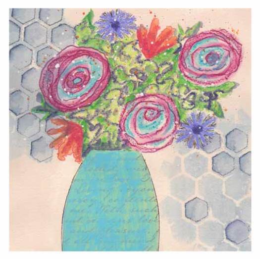
Inspired again by Carla’s wacky florals. Haha. I found the tutorial after I did the painting. The point, for me, is to loosen up. To not be so tight, so literal. I admire Carla’s playfulness.
I used a stencil with Inktense pencil. Painted with thinned acrylic. Then I used the stencil to outline some of the shapes, again with Inktense. The shadow areas this created are more viable in person. I added the vase, collage, and painted it with watercolor.
I scribbled the blooms with Caran d’Ache crayons. Wet some areas. Added pen details to the purple, and used watercolor pencils on the orange blooms. (Thanks Nelvia!) I added the green, (leaves) which turned out to be too light. So I added scribbles to that. I wasn’t really happy with this. But I added splatter, and now I feel it is not a total loss. Haha.

Trying to be a little wacky and loose. Maybe I shouldn’t have made the Crysanthmums perfectly round. And the green line on the top flower is too light and too close in value to the rest of the bloom. I really like this color combination. I’ll have to use it again 🙂
You have some really nice colour blending in these pieces Sheila but my fav is the cactus – even with out the ‘pears’
Thank you Val 🙂 The cacti are fun to paint. So glad you like it 🙂